Jun 2024 - Dec 2024
Simplifying Fontilio’s UX: A Redesign that Boosted Conversion by 33%
My role
I was the UX Designer, IxD (Interaction Designer) and UI designer throughout the project cycle from planning and requirements gathering to strategy, user research, wireframing, prototyping and design iterations.
Also collaborated with the product owner and development team to brainstorm ideas and problem solve.
Skills
User Experience
Visual Design
Design Systems
User testing/Research
Prototyping
Deliverables
Component Library
High Fidelity Designs
Usability Testing
Team
Myself
Product Owner
2 Engineers
Project Overview
Transforming Fontilio into a smoother, simpler online water shopping experience.
Fontilio, a bottled water delivery service launched by the startup KHT in 2022, offers a convenient way to get water delivered across Italy.
However, users started running into issues, including navigation difficulties and frustrations with ordering. To fix these problems and better align with business goals, a redesign was needed to improve the user experience and support the company’s growth.
The Challenge
Tackling Cart Abandonment and Improving Customization
Two years after launching, Fontilio's ambitious vision was getting lost by both its complexity and restrictions in the purchasing process. Features like the Customizable Automatic Water Delivery Plan were innovative, but core functions were buried.
Users couldn’t combine different water package types in a single order, and the unclear 4-pack rule left them confused. With a disjointed architecture of key elements, users lost focus and guidance throughout the flow, leading to frustration and cart abandonment.
The Plan
Turning Challenges Into Opportunities to Simplify Water Delivery
Faced with significant obstacles, we decided to take a bold step: a complete redesign of the platform, with a clear focus on enhancing the user experience.
This approach led us to rethink how users interacted with the online ordering process. We broke down key tasks into smaller, easier steps, choosing water types, entering details, and completing payments, making the process smoother and more intuitive.
Our ambition extended beyond improving the interface. We aimed to deliver a transformed experience with a design that seamlessly fits into our customers’ lives, making Fontilio’s water delivery service a trusted and simplified solution.
Understanding Business and research Goals
Two perspectives, one goal
A key aspect of this project was finding the right balance between two priorities: the users' needs and the business's objectives. While my research was primarily user-focused, I made sure to align it with the company's goals to maintain a well-rounded approach throughout the process.
An in-depth conversation with Fontilio’s CEO highlighted key challenges: user confusion during onboarding and significant drop-off rates at critical steps, like water selection. We also discussed simplifying the user flow, addressing logistical constraints, and ensuring that essential screens were immediately accessible.
This discussion set the foundation for the redesign to tackle both user frustrations and business objectives effectively.
Research Goals
Figure out what users want in a water ordering service platform, especially when it comes to customization and overall experience.
Understand why users drop out, especially at crucial steps in the process.
Business Goals
Get More Customers: Make the ordering process smooth and engaging to attract and keep users.
Simplify Ordering: Make it easier for users to customize their water packages and finish their orders.
Key Info Upfront: Show important screens, like package selection, Summary and key information right away without scrolling.
Fit the 4-Pack Rule: Design around the need to order in multiples of four, but keep it user-friendly.
UX Research
Uncovering the ‘why’ behind every click
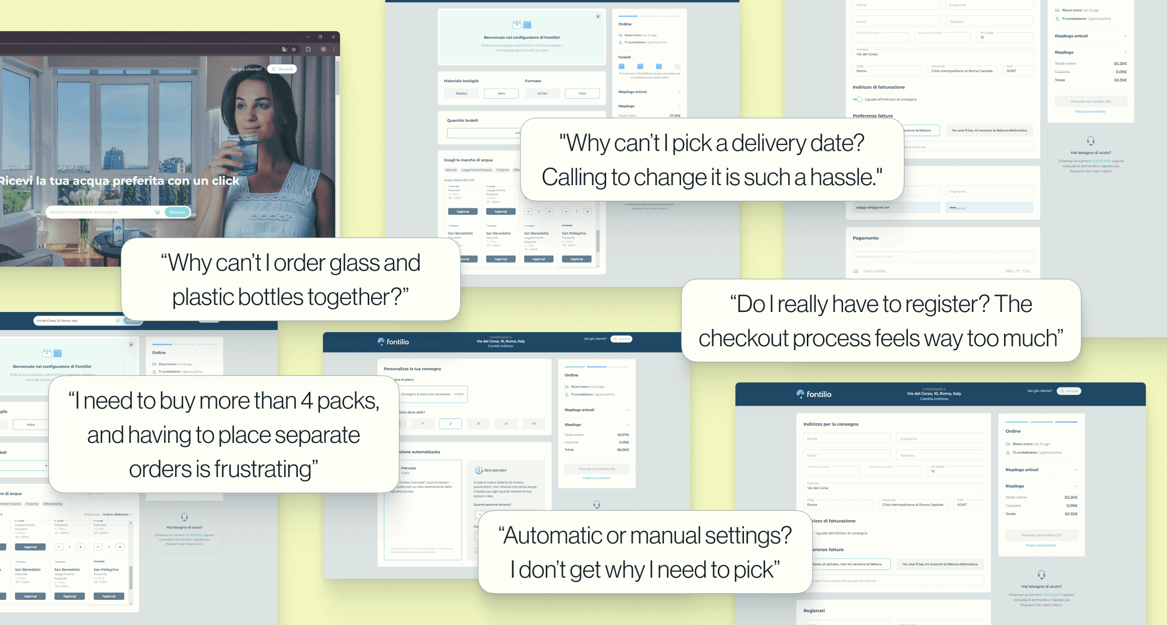
The first step was to understand the users' pain points and identify where they were encountering the most difficulties with the current platform.
I started with a general audit, which helped me spot some obvious weaknesses in the existing flow. However, we needed to dig deeper: gather specific and measurable user data to pinpoint where users were struggling the most and uncover opportunities for improvement.
I analyzed and documented their interactions with the platform, covering everything from their initial visit to the website, adding and customizing products in their order, to inputting billing and payment details.
"I tried ordering on Fontilio’s site but couldn’t choose a delivery date. I travel for work, so the default date didn’t work. I ended up calling to set a date that worked for me."
Filippo
41, Business Owner
"Why can’t I order glass and plastic bottles together? I prefer San Pellegrino glass, but I can’t just get one pack of that and the rest in plastic."
Martina
64, Retired
"I’ve tried a couple of water delivery platforms, and both were a bit confusing. I had trouble ordering smoothly, and they ask for too much info during checkout. I prefer platforms that ask for less to complete the order."
Piero
31, Employed
"I’m used to paying with PayPal or Satispay for online orders, but with Fontilio, I could only use my credit card. I don’t like entering my card details on new sites. Also, the platform only let me buy 4 packs of water per order. I wanted to buy 4 more for my mom next door."
Cinzia
52, Employed
had trouble navigating the flow, especially when trying to add water cases in multiples of 4, showing a need for clearer communication.
were confused when the system asked them to choose between manual and automatic ordering, with most preferring manual for their first order.
felt frustrated by the amount of information needed to complete an order.
Key Takeaways
The Customers
Are frustrated with the lack of clear cues to start the ordering process. Confusion around the 4-pack order requirement, limited customization options, confusion between automatic and manual plans, too much information required for payment and blocked delivery date also add to their frustration.
The Business
Wants to attract and keep more customers while reducing drop-offs in key steps, simplify the buying process, make key screens immediately visible, and ensure the 4-pack rule is easy to understand.
Building Clarity
At this stage, I had a sense of how we might enhance Fontilio' s UX

THE REDESIGN
I started by simplifying actions in each UI, breaking them down into smaller steps to reduce cognitive load and make tasks faster to complete.
The first step was removing outdated content and simplifying processes before introducing new elements. For example, I removed the automatic plan option from the main flow for new customers (data showed that no new users were activating the auto-plan).
Next, I focused on revamping the most critical steps: product selection and order customization. At this stage, I created a flow diagram and sketches that guided the redesign process.
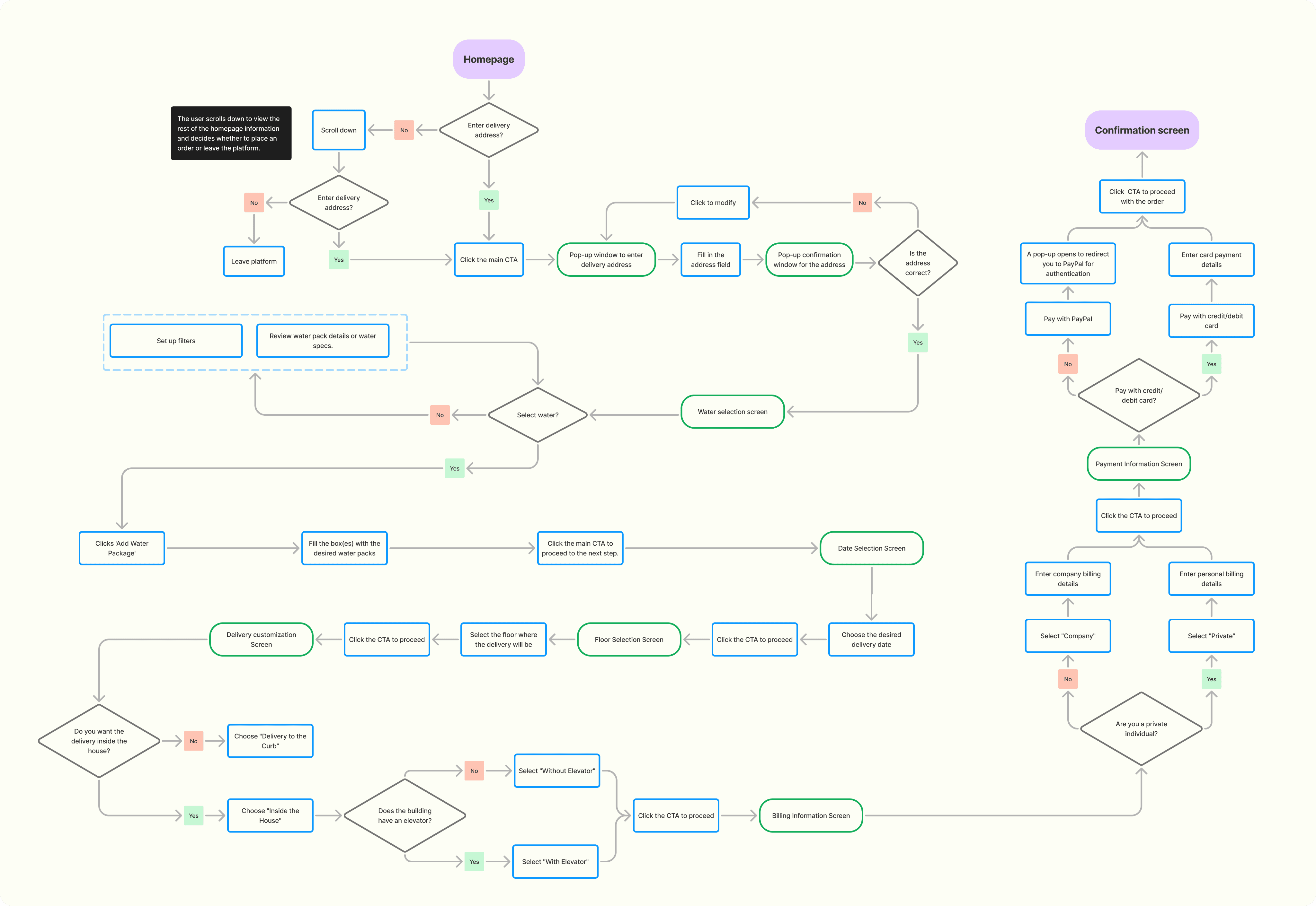

Restructuring Fontilio’s Page
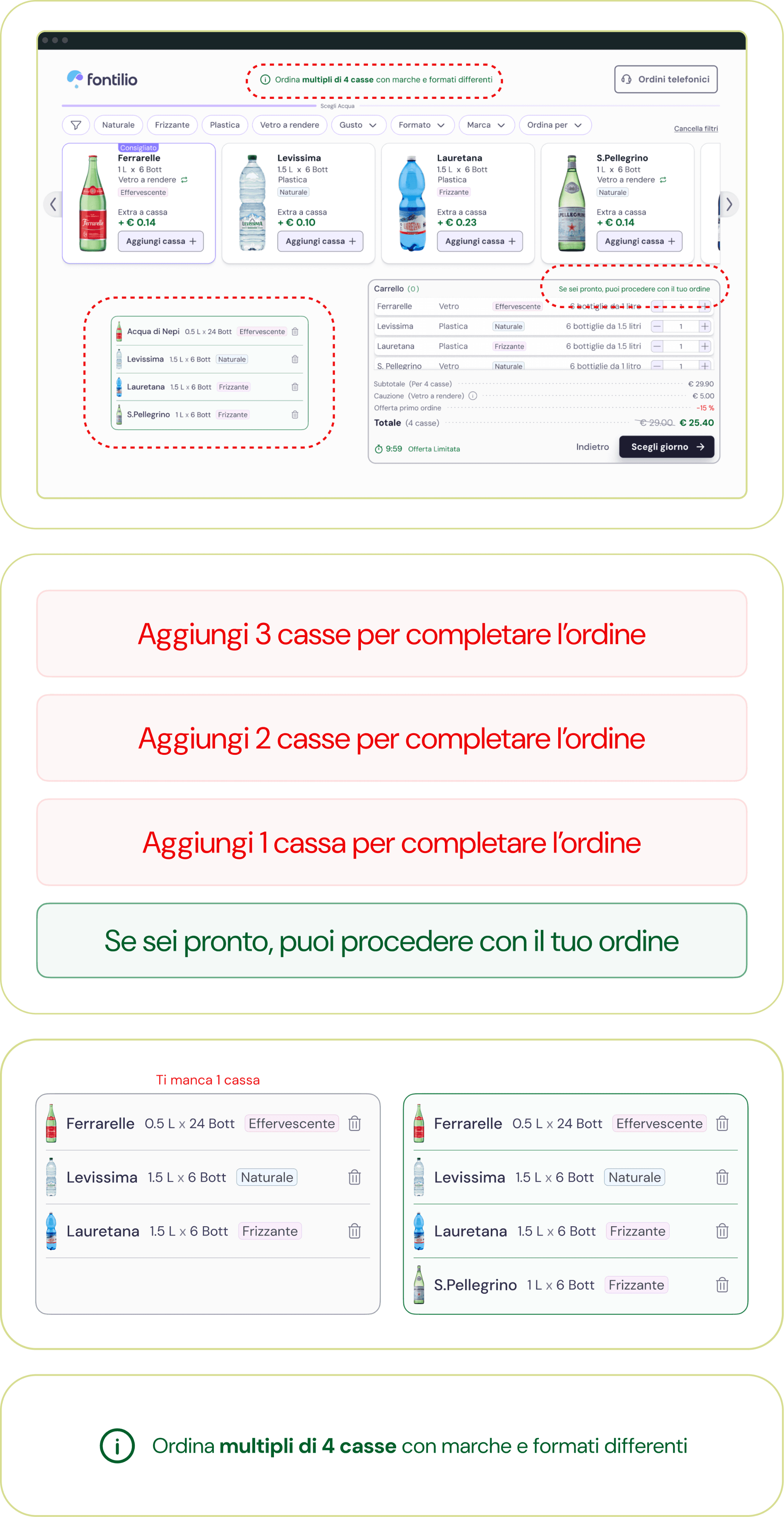
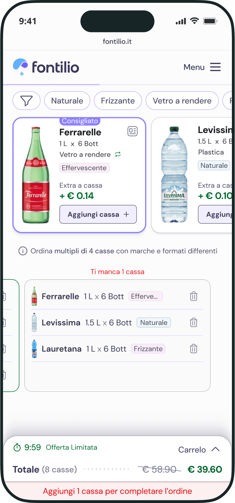
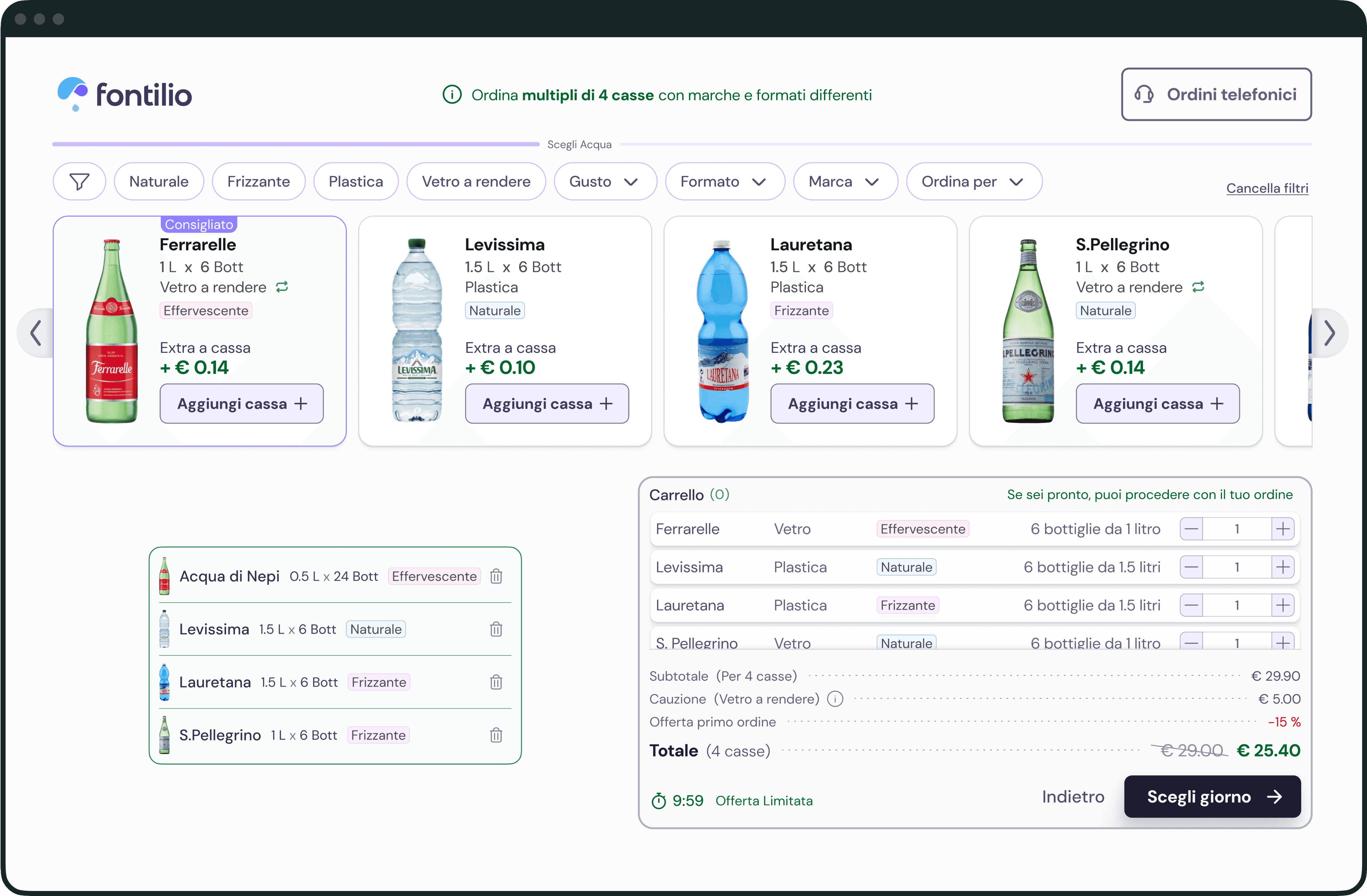
User research revealed that most had trouble understanding the concept of ordering in multiples of 4 water packs.
This was critical because frustration at the start of the purchase process could impact conversions, order completion, and the overall value of other pages and features.
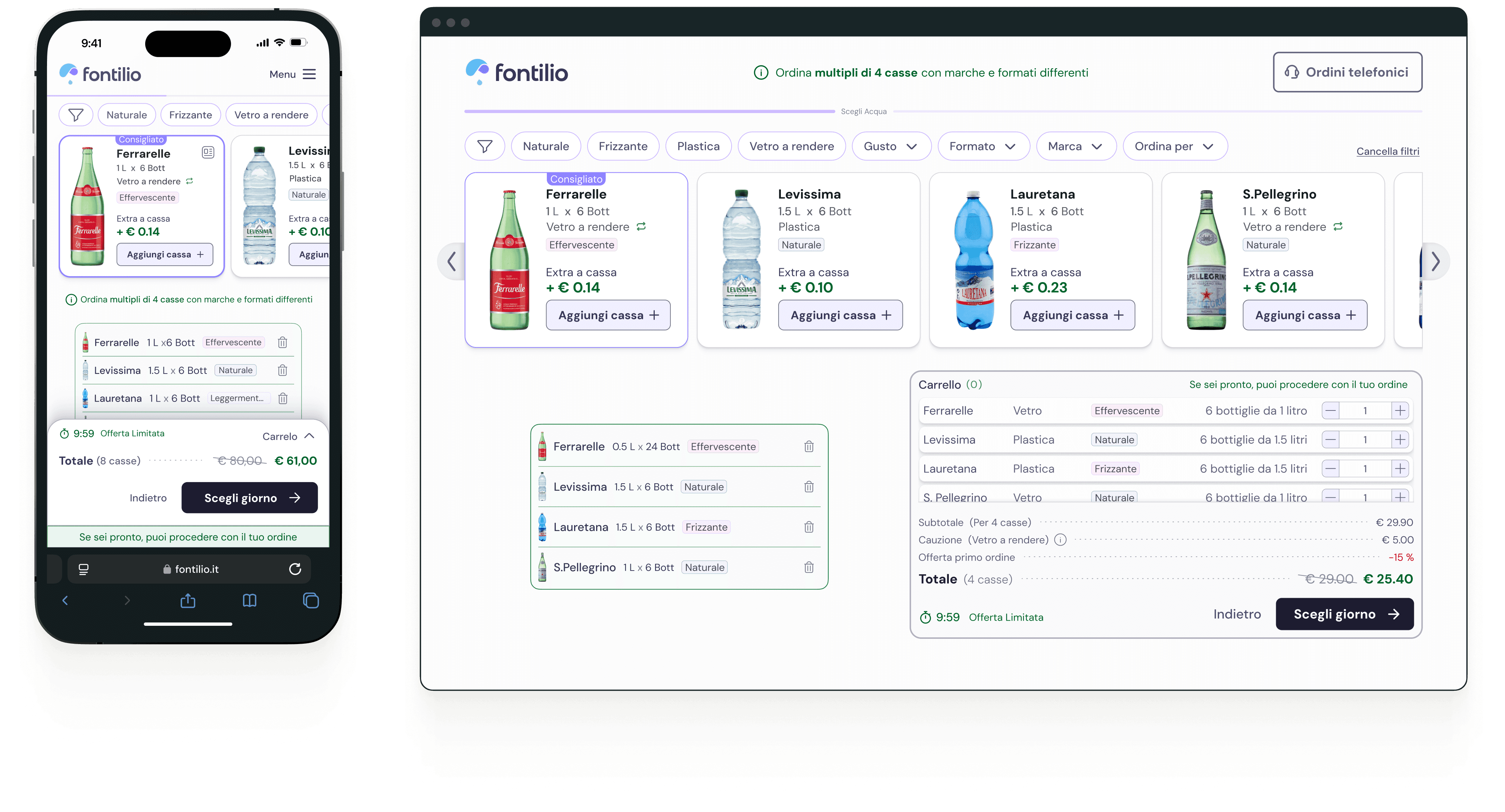
To address this, I prioritized redesigning the water pack selection interface and adapted the new UI across other pages, focusing on features that resolved user pain points.
Several elements change state to help users understand when they’ve completed a pack of 4 water bottles. There’s also a clear microcopy explaining the concept of ordering in multiples of 4.
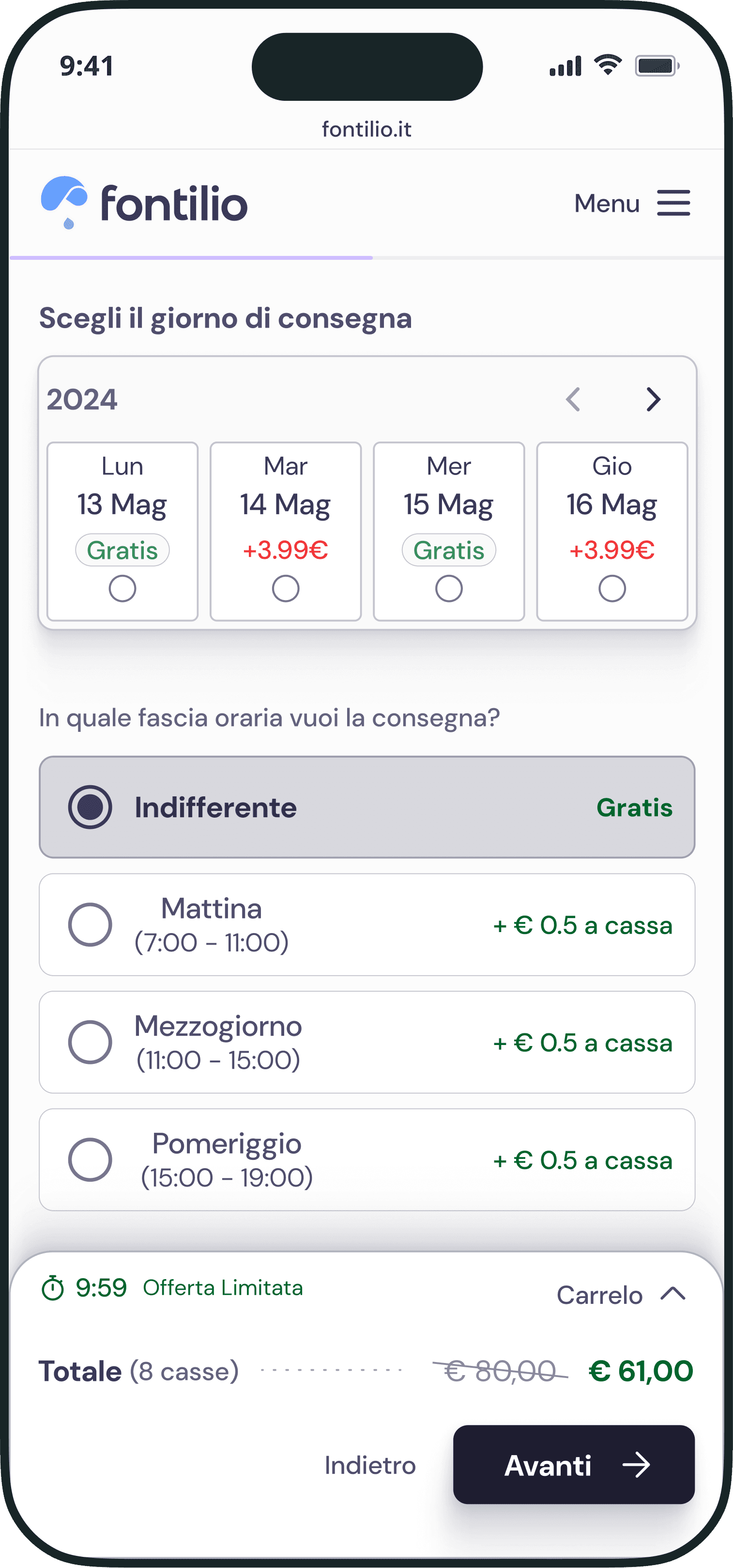
Delivery Customization in Simple Steps
Choose Delivery Day
Pick the day and choose from 3 available time slots for your water packs, something users really wanted.
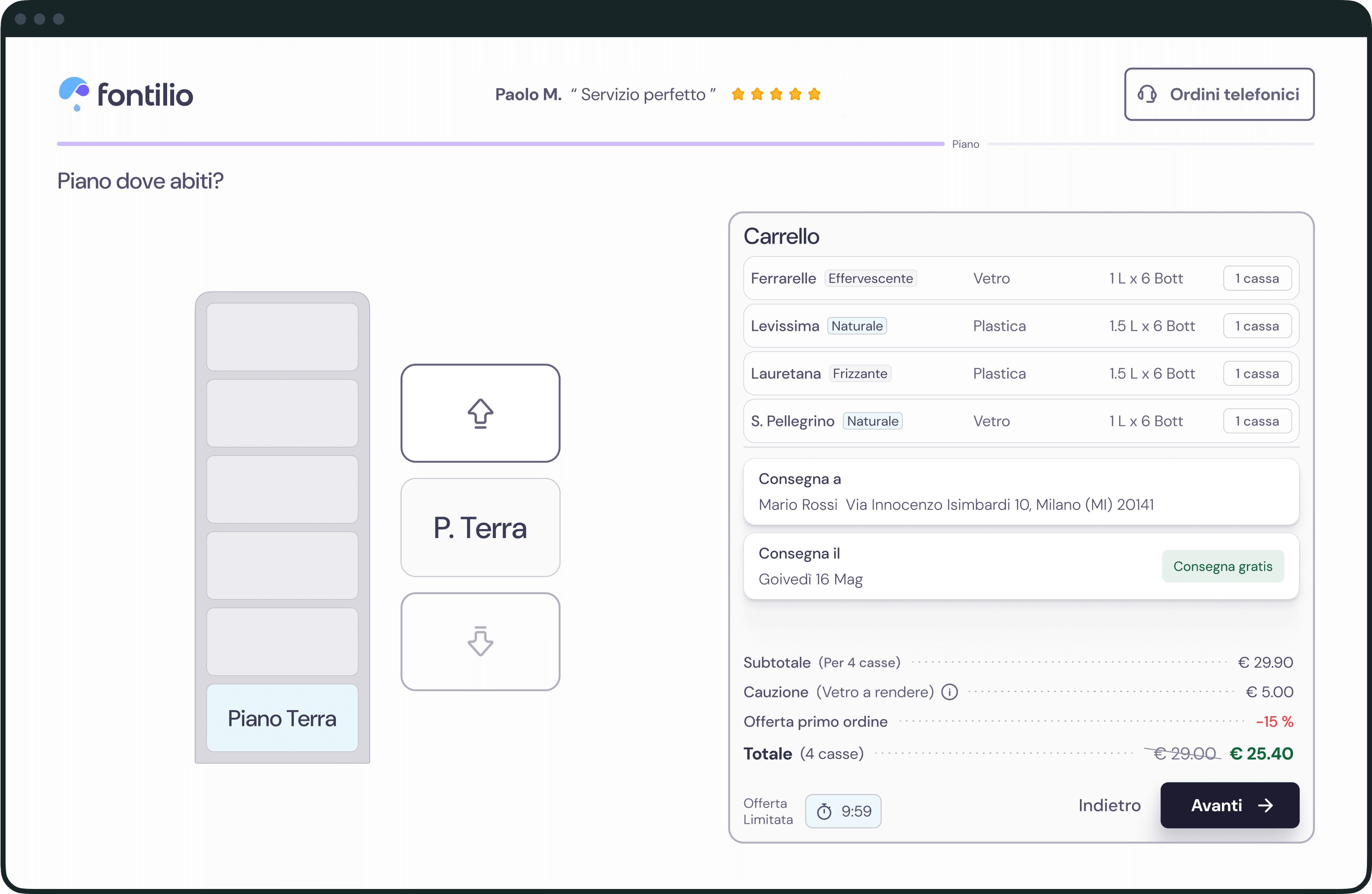
Select Floor
A simple visual lets you pick the delivery floor with just one click.
Pick Exact Delivery Spot
Decide where you want your order—right outside your house on the street or delivered directly inside.
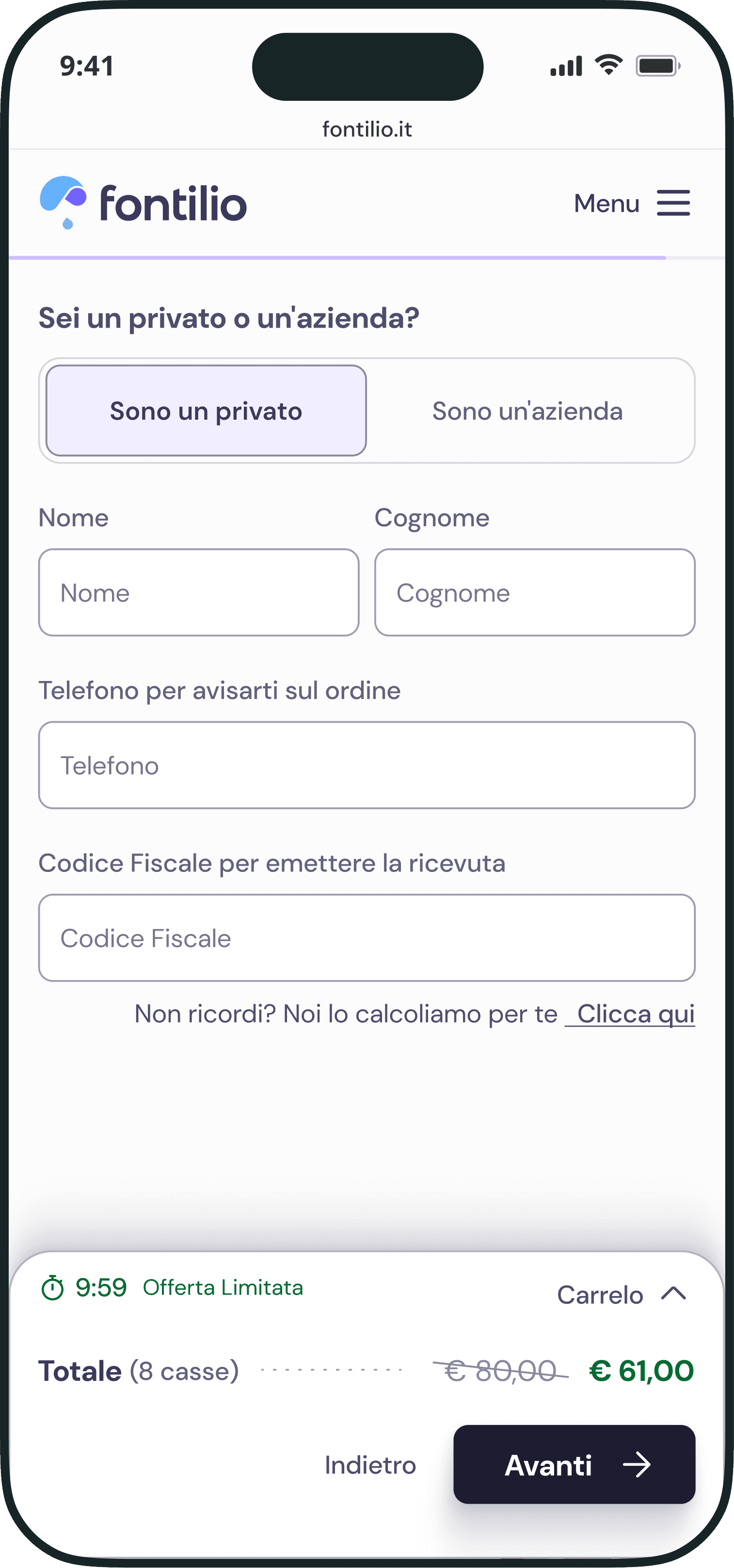
Billing Info
We only ask for the essentials, plus you can let the system calculate your tax code if you don’t have it handy.
Payment Info
Pick from the payment options available, quick and hassle-free.
Every element Thoughtfully crafted


Try desktop prototype here
Iterations
Reaching this solution was possible thanks to the usability studies conducted.
Listening to user feedback allowed us to iterate and validate which solutions worked and which aspects needed adjustments. Here are some of the changes implemented:
4-Pack Rule Popup


Water Pack Confusion


Delivery Time Slots


Visual Cues for Order Setup


Results
Seeing the Impact of Our Efforts.
Launching Fontilio’s redesigned platform was a key milestone. After weeks of refining the design, gathering feedback, and collaborating with the team, we were ready to see how it would perform.
It wasn’t just about a new design—it was about creating smooth interactions and making tasks easier for users. The project was a success in every way.
Time on Task Reduction
In the usability studies, we found that we could cut task time by 20.7% (from 337.4s to 267.8s). With a 100% Task Completion Rate, users were completing tasks faster and without any issues.
Customer satisfaction
User research showed the platform is easier and more intuitive, and 91.5% of test participants were happy with it. This just proves the redesign is helping users get things done smoothly.
User-Approved Improvements
With this score on the SUS from usability studies involving 42 participants, we got a clear thumbs-up on the platform’s usability. It’s a solid confirmation that the changes we made really hit the mark with users!
Boosting Conversion Rates
Two months after launch, Fontilio’s conversion rate jumped from 0.9% to 1.2%, a 33% increase. In a niche like this (In Italy, the average CVR is around 1.00%), it’s clear the new design is not only helping users but also driving real business results.
Lessons
Lessons from an intense and rewarding journey with Fontilio.
01 Building Around Users, Building for Success
I really enjoyed trying to understand Fontilio’s customers and designing a new experience around their needs, pain points, and motivations. Connecting with and understanding users is crucial for me in every project, it’s what helps create solutions that actually make an impact. With Fontilio, it was no different, proving once again how valuable user feedback is when it comes to making the right design decisions.
02 Fast Pace, Big Growth
Working with a startup was intense. The pace was fast, and the challenges were constant. As a product designer, I wasn’t just focused on the design—I was also collaborating with marketing, copywriting, and adjusting to changes as they came. Every decision had to align, and there was no time to waste. This project pushed me to grow in ways I hadn’t expected.
03 Flexibility Is Key
In a startup, things change fast, and you have to be ready to adjust on the fly. This project taught me the importance of being flexible, making quick decisions, and staying aligned with everyone, even when the plan wasn’t always clear.
Next steps
After the successful redesign for first-time customers, the focus is now on making Fontilio even better. Here's what's on the horizon:
Streamlining the Experience for Returning Customers
Next up is revamping the experience for returning customers, redesigning the repeat orders section to speed up reordering and make it more personalized.
Keeping Users in the Loop
As new features roll out, continuous user testing will be key to catching any issues early and making quick adjustments.
Rewarding Loyal Customers with Points
To keep customers coming back, we're looking into a points system where customers earn points with every water pack purchase, which they can later trade in for discounts on future orders.
Keep exploring

All rights reserved
Made with Figma & Framer